Thursday, 5 April 2012

Course Conclusions

http://www.bellenews.com/2012/02/02/world/us-news/michelle-obama-completed-25-push-ups-on-ellen-degeneres-show/

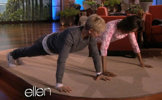
The image I chose for my final blog post is of the First Lady Michelle Obama engaged in a push-up competition with Ellen DeGeneres on the Ellen show. I chose this specific image because, simply put, I think that its awesome. The Obamas are changing the face of American politics with the way they carry themselves, and for their "approachable" personas. This photo was taken during the First Lady's California tour, promoting physical health and fitness. While it is quite common for Ellen to challenge her guests to perform various bizarre and embarrassing tasks on her show, I admire the fact that someone with such a prestigious title would be so easy going and willing to look silly on national television. 

This image made me think of our Visual Analysis class because not only have we spent a great deal of time talking about the Obamas and the way they are portrayed in the media, but also because while this is a fairly candid shot, I think it encapsulates exactly how the First Lady wishes to be portrayed. Michelle Obama made her appearance on Ellen in dark jeans and a casual pink top. She certainly could have dressed up and presented herself in a more 'polished' or business-like way, however she was trying to convey that she is really like an average American while she was talking about the importance of physical activity. With this more relaxed appearance, she is more easily able to relate to the busy working moms, and the demographic that would be watching Ellen. It also helps her campaign message to show that she actually does the activities she is endorsing. 

This class has really changed the way I perceive advertisements and documentary photographs. I think its incredible that an entire argument can be constructed and presented with strategically placed wording and images. While I was obviously aware that advertisements were designed to appeal to the audience and persuade them to buy the product, I had never really considered the extent to which they are manipulative. Now, when I see an ad, I look specifically at its layout, colouring and font contrasts. This course has really opened my eyes to various career paths as well, that deal with public relations and image consulting. This was also my first time blogging, and I found it to be a really great way to make your opinion heard on an issue. I hope to continue this blog after the school year finishes, and to continue thinking critically about what is presented to me in the media.
Tuesday, 27 March 2012

Machu Picchu

http://www.peru-machu-picchu.com/

I chose this image for my blog post because to me it combines both a documentary style photograph with personal associations. I have yet to make it to Peru, but it on my list of must-see countries, and I hope to go there next year to do the Machu Picchu trek.

I think this image is especially effective as a documentary image because the photograph is pulled out enough to show the majority of the preserved Inca village, while still showing its incredible location embedded in the mountains. The affect of the clouds wrapping around the mountain shows the sheer altitude and the fact that it is very much a part of the natural landscape. The bright blue sky peeking through at the top reminds the viewer that the Village is actually outside, whereas more close-up photographs can be misleading, looking more like a man made exhibition.

Machu Picchu is a World Heritage site, but there have been talks of shutting down the tourist trails, as they are becoming to hard on the landscape, thus making it difficult to protect the integrity of the pristine preservation. Photographs like the one above may be the only way to experience the beauty of Machu Picchu. In this sense, documentary style photographs become an integral part of history lessons as they come as close as possible to encapsulating the magnitude of the 'World Wonders'.

Thursday, 22 March 2012

Exclusive Memes

Facebook user, from the group Type 1 Diabetic Memes


Facebook user, from group Type 1 Diabetic Memes

For those unfamiliar, 'memes' are an incredibly popular internet phenomenon that has grown in this past year. Generally they are comprised of a single image, with a caption at the top and another at the bottom. They are normally used to make fun of something specific, or just to get a laugh. The Type 1 Diabetic Memes Facebook group (pass along to any T1s you know!) was created in January this year, and hosts tons of these images. I couldn't pick a favourite, so the above are two that were close in the running.

For the life of me, I can't understand why these 'cartoons' of sorts have become so popular. Virtually anyone can make them with a basic program like paint, and the possibilities are endless as to what you can create. A trend I have notices are the more 'exclusive' memes, which target a specific group. Others that are not part of this group might not find the memes to be that funny, or miss the joke all together. For this particular T1 Diabetes group, the memes have taken on a rather therapeutic outlet, which I found interesting. While a very select group will understand the meaning, those that do can surely relate or have had a similar experience. For the first images, most non-diabetics do not experience recognizable symptoms of low blood sugar, and therefore do not understand the intense need to spike it up by eating something sweet. For a T1 diabetic though, this means frantically tearing through your cupboards in search of your favourite snacks. 

For this particular group, memes have essentially become illustrated inside jokes. While other groups or fan pages use memes as a light hearted joke, I think its kind of neat that these specific illustrations can be reassuring, letting the viewer know that other people experience this too.

Monday, 12 March 2012

Topic Proposal: McDonald's Takes Over

http://mineau.wordpress.com/2010/08/29/great-fun-in-macau-and-hong-kong-by-olivier/img_2337/

For the final assignment I would like to look at the McDonald's franchise, and what I will call "McDonalds culture". McDonalds culture includes their advertising and marketing, and the way their menus and style adapts to fit the demographic it is targeting. I always find it mind-boggling the way they are able to find a way to incorporate their restaurant in any city, with any architecture and it seems to fit seamlessly: I think they are incredibly marketing-savvy. 

Their ability to successfully advertise themselves serves as a way to distract the consumer from how terrible the food actually is. I would like to try to use some evidence from the documentary Supersize Me, either in my paper, the presentation, or both. I think the some of the strongest evidence for this case will also come from the nutritional information for some of the popular products, to show a contrast between the glamourized burger and its actual nutritional content. I'm definitely interested in putting a public health spin on the paper, but I'm a bit worried its sidetracking from the rhetorical analysis. Any suggestions would be appreciated!

I'd like to use both advertisements and photographs to support my case, and I think photographs will work really well here, because they function both as ads and as a contextual placement for the restaurant in its surroundings. Data and nutritional facts will also speak really strongly, especially alongside images to show what McDonalds culture contributes to society.

Tuesday, 6 March 2012

Sebastian Cosor's take on The Scream


http://youtu.be/UfO4WuI9IIo

http://upload.wikimedia.org/wikipedia/en/thumb/f/f4/The_Scream.jpg/220px-The_Scream.jpg


Edvard Munch's early 20th century painting the Scream is quite well known around the world, and is what I personally would classify as 'high art', for its detail, medium and talent. The above video is an interpreted animated version of the Scream, done by Sebastian Cosor. Not only is the piece accompanied by music in Cosor's video, but two other characters are also introduced, and the shift consequently focuses from the main subject of the original work to the two male characters. 

The video dramatically changes the original tone of the painting, in the sense that the audience no longer has to work hard to read the expression of the painting's subject, it is already interpreted for them through the music. I honestly don't really know what to make of it--the subject seems to be agonizing over death, and while this is definitely disturbing, I still don't know whether or not it's more or less effective than the original painting.

One thing i really admire is how Cosor really brought the background of the painting to life. The reds of the sky and blues of the valley are very vivid in comparison to the original painting, and the video allows for more play with shadows, adding to the overall sombre tone. The background goes from being very abstract to being much more concrete, with houses added. 

Overall, I admire the idea of adapting a painting to another art form, but I'm not entirely sure I like how the message of the painting is spelled out for the reader, eliminating any chance for the reader to connect with the painting on a more intellectual level. 


Monday, 27 February 2012

Topic Proposal: Vintage du Maurier Ad

http://www.vintageadbrowser.com/tobacco-ads-1950s/2

I chose this ad for the second rhetorical analysis project because I think that it's visually stunning and I really like the way the red stands out. The ad originally came out in 1952 for a Canadian audience. I think the ad is very simple, I like the soft lines of the illustration and the bold print of du Maurier juxtaposed with the cursive description below.

The ad suggests a life of luxury and class, with the high wing-back red chair and the woman's long evening gown and manicured hand. The fact that the woman's face is hidden is mysterious, and the viewer is left visualizing the rest, lingering over the ad itself. The words "waiting for you" and "make up your mind" are inviting and essentially seduce the viewer.

Saturday, 11 February 2012

Promoting Healthy Eating

http://youtu.be/LTsKh0YVKJY

In January of 2011, the USDA revamped their healthy eating campaign to include the "myplate" guide, a new demonstration of a nutritious balanced diet targeted at the average American. While the concept is a great idea, incorporating elements of portion control and nutrient balance, this intro video is just plain sad. While it is beyond obvious that the diet of any average North-American citizen could use some help, these  healthy eating campaigns are far from inspiring or effective. 

In this video specifically, the music is dated and the kids speaking do not seem to be terribly interested in what they are talking about. While its true that most kids aren't authorities on vitamins and nutrients that are plentiful in produce and grains, the ad could be much more relatable to kids, showing foods that they might actually like rather than raisin bran. There are healthy foods that aren't as boring looking, like fresh fruits and veggies, or chocolate milk. If the video associates healthy food with bland tasting food, the message kids will ultimately take away from the video is that healthy eating just plain sucks.

While the USDA might not have the same budget that Coke or McDonalds does to make high quality advertisements, I think that there are quite a few simple things that they can do to change their video campaigns to make them much more effective and memorable. If the authorities are trying to push healthy eating in society, they are going to need to put more of a priority on actually making it appealing and popular.

Monday, 6 February 2012

Tiffany's Blue

http://red-soledfashionista.blogspot.com/2011/02/valentines-day-at-tiffanys.html

I think this Tiffany's ad is absolutely gorgeous. The setting is very pretty, and the woman's dress exudes elegance and style. The only way to recognize that this is a Tiffany's ad, or even a jewelry ad, is by the small blue box the man is holding behind his back. Tiffany's has done a remarkable job of branding themselves to be instantly recognized by their signature colour. Since Valentines day is fast approaching, a few different versions of this ad are circulating online and in various fashion magazines. 

I think this ad is effective because the company's name appears nowhere on the image, and yet people understand who they are, what they are selling, and who they are marketing towards all from one single photo. From this photo, one can deduct that the couple is young and stylish (based on their attire), and the city background ads a sense of sophistication. The rain-dampened setting also ads a colour contrast to luminosity of her dress, making it stand out even more. The ad suggests that if you want to show that you are sophisticated and stylish, that Tiffany's is the right fit for you.

This ad is most definitely marketing a lifestyle, or selling a potential milestone moment. It suggests that if a man buys his significant other jewelry from Tiffany's, then she will be ecstatic and madly in love. For a woman, it suggests that a man has chosen an elegant and classic piece of jewelry, not to mention he spent a significant amount of money to make her happy. I think it is fair to say that Tiffany's is definitely selling a status, and that it is attempting to define a more elite population.

Wednesday, 1 February 2012

Topic Proposal: The Power of Oprah

http://www.coolmyspacecomments.com/barack-obama-3.html


The image I have chosen for our Rhetorical Analysis assignment is called "Oprah Winfrey vs. Barrack Obama". As you can see, Oprah's character is towering above and overshadowing that of President Obama's. There are no speech bubbles or captions, because the viewer is supposed to infer that during the election process, Oprah acted so strongly as an advocate to for Barrack Obama, that he essentially got elected due to the powers of persuasion Oprah has on her public.

I would like to look specifically at the body parts emphasized in each character. For Oprah, this is her mouth, due to the fact that she is well known for her persuasive speeches, and her talk show was watched almost religiously by millions of viewers five days a week. For Barrack Obama, his shoes are enlarged, representing the fact that he had large shoes to fill, based on the excellent persona that was projected on his behalf. This also balances the image because your line of vision is drawn across the entire image.

I would also to analyze the fact that Oprah is drastically larger than Obama, which is reflective of her celebrity status, and also correlates with their power roles. While technically Obama is running the country, it is sadly celebrities that have more control over how the population acts in today's society. As we have discussed in class, many ad campaigns employ celebrities to promote their products, and this political cartoon is applying the same ideology to Obama's past presidential campaign.

Wednesday, 25 January 2012

Think Pink

http://hometestingblog.testcountry.com/?p=9771

This pink breast cancer ribbon is quite possibly one of the most easily recognized symbols in today's society. Without any words or context, the ribbon is understood to represent hope and support for victims past and present of breast cancer. This symbol has taken on various forms, from a plain ribbon pinned onto a jacket, to jewellery, to travel mugs, to bumper stickers. By simply typing in "pink breast cancer ribbon" in a google search, an endless list of options will present itself. 
To my knowledge, when products that have been branded with the pink ribbon are sold, a certain percentage of the sale will go towards a cancer research foundation. For example, when I was working at a Suzy Shier location, we sold pink mittens with the ribbon embroidered on, and 10% of the proceeds went to the Canadian Cancer Society. 
On the one hand, I think that the donations are an excellent resource for the Canadian Cancer Society and that it is very generous of the retail stores to donate proceeds in light of today's economy. That being said, when the pink ribbon is emblazoned on absolutely everything, I think it becomes more of a trend than a supportive gesture. This absolutely does not mean to say that I do not support the charity, I just feel that it somewhat takes away from the gesture when someone puts the pink breast cancer ribbon on their car because its "cute". I think breast cancer survivors are completely deserving of support, admiration, and respect for what they have undergone, and I hope that when people see this pink ribbon that they remember that, and not the last cute pink ribbon t-shirt they saw. 

Wednesday, 18 January 2012

Topic Proposal: Personal Narrative Essay

I have chosen these three images from the website Pinterest that I feel are well-suited to my personality:

http://pinterest.com/pin/153122456050200441/


http://pinterest.com/pin/128000814378776432/

http://pinterest.com/pin/155726099584896187/

I chose to do the personal narrative essay on images that describe my personality, because I think that you can actually learn a lot about yourself when thinking of the main reasons why you gravitate towards certain images. When looking through these websites, I did not have a specific theme in mind, or anything that would connect the images together, I was simply looking for images that I like. While at first glance there appears to be relatively little that connects a map-purse, a chair, and scrabble letters in a mug, I think that the images all have elements of creativity in the sense that they are someone's art work, or they have been "repurposed".

I chose the purse because I always carry a purse, and I seem to have a growing collection. Travelling is one of my many favourite things, and the map represents my various trips and aspirations for future endeavours and adventures. The recovered office chair is fabulous because it is green, my favourite colour, and I think that recovering chairs is an excellent and cost effective way to change a boring study space. I did a similar project, but it did not turn out as nicely as the one pictured above. The final image of the scrabble pieces in the coffee cup represent my love for words and writing (and perhaps competitive board game tendencies). 

In all of these images, the pieces in question are all set against a plain background, so that the viewer's eye is not distracted. The pieces are all very simple looking, there are no words to describe the process of the creation or why they were created, the pieces must be strong enough to speak for themselves. I find all of these images are visually appealing in colour, with one bold colour that stands out: blue in the map, green for the chair, and brown in the coffee. The pieces in all three are very rounded, with few straight lines or hard edges.


Monday, 16 January 2012

Day 1: Its my first blog... this is a big deal.

Hi everyone!

My name is Nicole and I am in my fourth year of completing an honours specialization in English, a major in Spanish and a writing certificate. The purpose of this blog is primarily to track my experiences in analyzing visual rhetoric, but also to share images that I find inspiring, funny and provoking. As we are constantly bombarded with images in our daily lives, I think that it is important to take a moment to think about what we are seeing, and how it affects our mood, curiosity and thought process. The images I will post have done just that: made me think critically about them whether it be in their layout, placement or intended purpose.

This is an image I absolutely love:

http://pinterest.com/pin/126593439495340816/

I found this image on a website called Pinterest.com. I feel that this image really represents me well because it combines two things that I value: fitness and determination. First of all, fitness is extremely important to me, and a part of my life that I take very seriously. I think that it would be pretty accurate to say that I am determined to the point of being incredibly stubborn, and if there is something that I want to accomplish I will work hard to do so. I find the basic play on words in this image to be inspiring in its simplicity. 

The simplicity of the wording is what originally drew me to the image. The very last word the viewer is left with is "possible", and the resounding message that the reader can accomplish their goal (whether or not it be fitness related). In a larger sense, the short message is urging the viewer to look at images or words or circumstances for what they really are: if something seems impossible, look further into its components and it may very well be possible. 

The way the girl's facial expression is frozen mid movement, makes her look very intimidating, which definitely works in favour of the ad's motivational intention. The boxing gloves indicate that she is in the middle of exercising, and again with the shot being frozen in mid-movement, the viewer can really appreciate the force of her body. Also, her right had seems to be punching the word impossible, indicating that it can be broken apart into its components "I'm possible". 

One thing that could make this image slightly stronger, would be to change the colouring of the words possible and impossible, to further engage the reader's senses. 

Hopefully the images motivates you too!

Nicole Alexandra